Or, why clients often make me want to put a bullet in my head:
Thanks to Robert at ND for sending me the link to Today's Big Thing.
Showing posts with label design. Show all posts
Showing posts with label design. Show all posts
Wednesday, July 23, 2008

Tuesday, July 15, 2008
Why I am a Designer

My friend, and fellow designer Jason, just alerted me to this hilarious pie chart from the ChangeOrder blog. So true: especially the "chunky black glasses" part. Although, the chart is skewed at little toward our (how shall I say: slightly older) generation; I'm not sure my students will ever experience the joys of a Bestine high (mmm, such a superior solvent: I can still smell it) or the fine line elegance of a Rapidograph. Dick Blick is now marketing the Rapidograph as a quaint tool worth rediscovering, which "stands out almost magically against the bland precision of computer rendered graphics." How retro.
Wednesday, May 28, 2008
The Green Grocery Store Project

I recently read about the most amazing design project that challenged students to envision ways to raise consumer awareness concerning the actual recyclability (I don't think this is a word) of product packaging in the typical grocery store. The goal was to educate without condemnation, yet to influence consumer habits through clever and compelling design. KT Meaney at North Carolina State University did a fantastic job conceptualizing and implementing this project. For more images, check out the recycling awareness site that students created for the project.
Thursday, May 15, 2008
The Original Design Gangsta
Apparently, I'm the last person to hear about Kyle T. Webster's hilarious Design Gangsta video (at least according to my students). Of course, my students would do just about anything to avoid working on actual class projects, but they are well versed in design a la pop culture. At least they get the humor. But, Kyle, man, did you vertically stretch the Rosewood that rolls past the Mini? Shamies, you crazy gangsta.
Friday, April 18, 2008
One Precocious Designer

Let me introduce you to an utterly charming young designer. His name is Ethan Bodnar, "graphic designer, author and entrepreneur." He is currently working on a project (Grab Bag Book) to be published by HOW Books in which artists will make visual contributions based on creative tasks selected at random and distributed by Mr. Bodnar. His belief and mission is: "To use creative thinking to change the world. To spread messages and share ideas through my life and work." What lovely thoughts.
Upon investigating his spiffy little website, I discovered that Ethan Bodnar is an 18-year old high school senior. Since I regularly come into contact with 18-year old designers in training, I was surprised at the level of professionalism and passion for design exhibited by this precocious young man. I hope that after four years of design school his optimism and zest for design remains intact. To learn more about Ethan, check out the Speak Up site.
Wednesday, April 2, 2008
Designers Get Green in San Diego

Last weekend, we packed up the Prius and traveled down to San Diego for the 13th annual Y-Conference. This year's theme was Seeds of Change and tackled issues of sustainability in both design and life. I adore this conference, because the quality of speakers is consistently top notch (of course, there are always a few duds, but this is impossible to avoid), the San Diego chapter of the AIGA is eclectic (designers seem authentic and wear colors other than black) and totally non-snooty, the University of San Diego is a lovely location, the weather is glorious in late March, and the conference is very affordable by AIGA standards. I was so excited when I learned about the theme of Y-13 and couldn't wait to bask in the eco-love.
And I was not disappointed. Robert Noble, of Envision Solar is now my hero. For years I've been ranting about parking lots in SoCal and all that sun that could be generating energy. Well, Mr. Noble is covering those God-forsaken, hotter than hell, gigante mall parking lots with Solar Groves™. What a poetic name for and beautiful incarnation of green design at its best. This is just one of Mr. Noble's many innovative and progressive projects; the man is a true visionary and all around cool guy.
Another super duper inspiring speaker was Brian Dougherty of Celery Design Collective, based in Berkeley. Not only does Celery Design create beautiful work, but it is also eco-innovative, big time. They even created a free online ecological guide to paper to help designers make sense of PCW, ECF, PCF, TCF, FSC, etc. Holy cow, paper specing in more complicated than ever. Thank you Brian for proving that a fabulous printed piece doesn't have to include a matte varnish, a gloss varnish, a double hit of florescent ink, foil stamping, tip-ins, and full bleed images. In my view, any designer who does not at least consider issues of sustainability in their work is, well, a moron.
I have only one negative comment about the conference and that is: Organic ToGo sucks. And it sucks on a number of levels. First, the food lacks, well, flavour. Second, every single item is packaged in plastic. Third, and most horrific: BAGGED SLICED APPLES! Now, I am not a proponent of all caps or the exclamation point, for that matter, but the very core of my being is offended by bagged sliced apples. Apples: perfected packed by Mother Nature. Slicing apples drastically reduces their shelf life and necessitates the use of some form of preservative (usually asorbic acid). So instead of biting into a delicious, crisp organic apple, I had to suffer through soggy slices with a faint hint of what can only be described as chewable vitamin C taste: chalky and faux citrusy. The organizers of the conference actually apologized for the food and mentioned that they had hoped to avoid totally plastic-encased lunches. Oh well, these things happen.
All in all, Y-13 was educational, eye-opening, at times mind blowing, and very inspiring. Nice work AIGA San Diego: you guys and gals deserve a big meyer lemon martini for your efforts.

Tuesday, March 4, 2008
Anyone Can Be a Designer
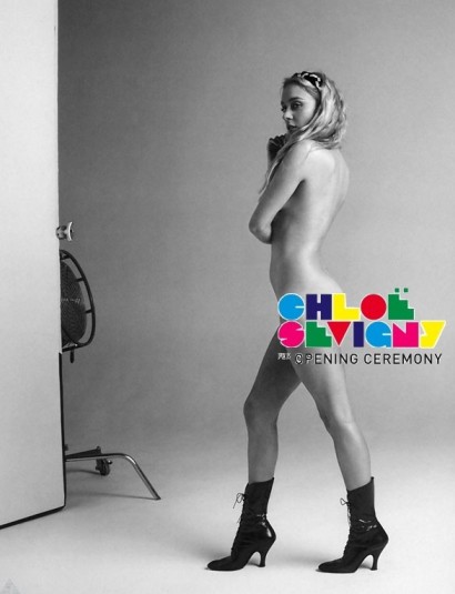
In general, I like my blog to be all about positivity. However, when my dear friend Jason alerted me to Chloe Sevigny's new line of clothing, I knew a rant was in order. I have long loathed Chloe Sevigny's unique and almost unequivocally figure unflattering fashion sense. Ms. Sevigny's wardrobe abominations and reluctance to powder her nose have gained her the rare status of "frequent offender" on the Go Fug Yourself site (my favorite guilty pleasure). Some would argue that Ms. Sevigny is a fashion impresario and if one sticks to the dictionary definition of "a person who puts on or sponsors an entertainment," this could be an accurate description. I'm just trying to imagine if Marc Jacobs or top American fashion designer Michael Kors or those cuties Lazaro Hernandez and Jack McCollough at Proenza Schouler are amused by Ms. Sevigny's audacity at assuming the role of designer. I know it chaps my a** when type bastardizing buffoons with a cracked copy of Photoshop call themselves graphics (with an "s") designers.
By the way, the look above is the most tasteful of the entire collection.
Thursday, January 24, 2008
The Candidates: By Design
Is anyone else out there feeling completely overwhelmed by this year's presidential election? I simply can't keep up with the various platforms, especially given the candidates' seeming collective aversion to addressing actual issues. In these situations, I can do one of two things: either curl up in the fetal position and take a news fast, or seek out an environment over which I have some control. In this case, that environment is the visual. So, here is my take on just a few of the candidates, based on the design of their websites and identities:

Let's start with Huckabee. There are so many different typefaces and type styles on this page that it creates an overall sense of clutter and visual pollution. And are those letterforms in his logo bastardized? Especially offensive is the design of the Help Mike Today box, in terms of typography, use of color and copy editing. Are you serious with "Become a Ranger"?
 Moving onto McCain. Hmm, liberal use of military iconography; I can dig on that, since I'm an Air Force brat and unrepentant fan of Top Gun (ah, the halcyon days before we discovered that Tom Cruise is a babbling lunatic). I don't hate the use of Optima in his logo, but I'm not sure that I would have gone with the bold version. The black and white flag behind the logo is a bit moody and subtle; I appreciate the somewhat toned down color palette. But, again, type styles: way too many. The italic on the right sidebar is the worst.

Honestly, I don't even know where to begin with Romney. For God's sake: his photo is horizontally stretched on the home page! The eagle/flag hybrid seems like an over-the-top addition to his logotype. You're patriotic: we get it. Really, would a non-patriot actually run for president? Isn't that a given. Although, compared to McCain's and Huckabee's sites, the designer was positively restrained when it came to typefaces and type styles.

Just to prove I'm not all about Republican-bashing: here's Edwards's all about bold typefaces site. And what is it about that red: it's not quite right. A bit too muddy. I might be able to handle it were it not for the use of the green accent colour. That green is just terrible, especially when juxtaposed against the red. Why, why the green swoosh on the blue star? Why a third color? Aren't red and blue enough?

If I were Hillary (have you noticed that everyone calls her Hillary instead of Clinton: I'm sure this is due to a desire to avoid confusion with Bubba and not related to sexism in any way), I'd want The Eurythmics's Sisters are Doin' it for Themselves to be my theme song. Damn: Aretha Franklin AND Annie Lennox. I'm playing it right now and I feel strong and empowered, like I could be comin' out of the kitchen to be leader of the free world. Let me tell you, Hillary, sisters don't select logos with skinny, lame, waving flags. Three stars? I know it's iconographic, but it just looks weird. However, like Romney's site, at least there aren't a bazillion different typefaces. But, Hillblazers has got to go.

Then there's Obama. I don't know what kind of president he'd make, but this man knows how to hire a designer (or, at least his people do). The typography is, dare I say it: sophisticated and actually pretty. I'm not gradation crazy, but the soft blue gradients are used quite well throughout the site. The sunrise over the stripes of the flag: okay, not earth-shattering, but the logo is not offensive in any way. Check out the Make a Difference sidebar. I love these different iterations of the logo. If you click on States, you'll see that each state has its own logotype that incorporates the rising sun logo within the name of the state. I cannot tell a lie: this website makes me happy and gives me hope for the future of our country (from a design standpoint).
Just to be clear, Juiciful does not endorse Barack Obama for president, but we do endorse the designer of his identity and website. Nice work.

Let's start with Huckabee. There are so many different typefaces and type styles on this page that it creates an overall sense of clutter and visual pollution. And are those letterforms in his logo bastardized? Especially offensive is the design of the Help Mike Today box, in terms of typography, use of color and copy editing. Are you serious with "Become a Ranger"?
 Moving onto McCain. Hmm, liberal use of military iconography; I can dig on that, since I'm an Air Force brat and unrepentant fan of Top Gun (ah, the halcyon days before we discovered that Tom Cruise is a babbling lunatic). I don't hate the use of Optima in his logo, but I'm not sure that I would have gone with the bold version. The black and white flag behind the logo is a bit moody and subtle; I appreciate the somewhat toned down color palette. But, again, type styles: way too many. The italic on the right sidebar is the worst.
Honestly, I don't even know where to begin with Romney. For God's sake: his photo is horizontally stretched on the home page! The eagle/flag hybrid seems like an over-the-top addition to his logotype. You're patriotic: we get it. Really, would a non-patriot actually run for president? Isn't that a given. Although, compared to McCain's and Huckabee's sites, the designer was positively restrained when it came to typefaces and type styles.

Just to prove I'm not all about Republican-bashing: here's Edwards's all about bold typefaces site. And what is it about that red: it's not quite right. A bit too muddy. I might be able to handle it were it not for the use of the green accent colour. That green is just terrible, especially when juxtaposed against the red. Why, why the green swoosh on the blue star? Why a third color? Aren't red and blue enough?

If I were Hillary (have you noticed that everyone calls her Hillary instead of Clinton: I'm sure this is due to a desire to avoid confusion with Bubba and not related to sexism in any way), I'd want The Eurythmics's Sisters are Doin' it for Themselves to be my theme song. Damn: Aretha Franklin AND Annie Lennox. I'm playing it right now and I feel strong and empowered, like I could be comin' out of the kitchen to be leader of the free world. Let me tell you, Hillary, sisters don't select logos with skinny, lame, waving flags. Three stars? I know it's iconographic, but it just looks weird. However, like Romney's site, at least there aren't a bazillion different typefaces. But, Hillblazers has got to go.

Then there's Obama. I don't know what kind of president he'd make, but this man knows how to hire a designer (or, at least his people do). The typography is, dare I say it: sophisticated and actually pretty. I'm not gradation crazy, but the soft blue gradients are used quite well throughout the site. The sunrise over the stripes of the flag: okay, not earth-shattering, but the logo is not offensive in any way. Check out the Make a Difference sidebar. I love these different iterations of the logo. If you click on States, you'll see that each state has its own logotype that incorporates the rising sun logo within the name of the state. I cannot tell a lie: this website makes me happy and gives me hope for the future of our country (from a design standpoint).
Just to be clear, Juiciful does not endorse Barack Obama for president, but we do endorse the designer of his identity and website. Nice work.
Tuesday, January 22, 2008
Your Toothbrush's Carbon Footprint

On Saturday, I attended AIGA's Compostmodern conference in San Francisco. The conference was organized by the S.F. chapter of the AIGA and AIGA's Center for Sustainable Design. It's exciting that designers are talking about sustainability even though the concept of sustainability seems at odds, or downright antithetical, to a lot of graphic design. Afterall, don't designer's love itty bitty type surrounded by white space, glorious white space? Certainly, the AIGA has sent out its fair share of multiple page publications with florescent inks and vellum overlays. But, change is good and change is progressive and I do think that AIGA and designers are trying to change.
One of the speakers at Compostmodern was Valerie Casey, the founder of The Designer's Accord: "a call to arms for the creative community to reduce the environmental impact caused by design, and to work collaboratively to inspire sustainable change." Her talk was impassioned and quite inspiring, although, there were multiple mentions of purchasing carbon offsets, which seem like a big sustainability boondoggle to me. Can matter, once created, be eliminated, oh, I mean, offset? Wouldn't it be better to reduce business travel, given that we are living in an age of easy and inexpensive global communication.
 Another thing that came up in Ms. Casey's talk was the design of the toothbrush and how horrified one of her coworkers at IDEO was to see his design wash up on the beach five years later almost perfectly preserved in its original sparkly plastic glory. Which got me to thinking: why can't industrial designers come up with a reasonably designed toothbrush? Toothbrushes are now so bloated and over-designed that older toothbrush holders (the kind with little holes in a closed container) cannot accommodate them. The design of such toothbrushes has long annoyed me given the ephemerality of this product. Isn't it just the bristles that need replacing every there months, anyways? Imagine the carbon footprint of our country's collective toothbrushes. Here's my call to arms to all you product designers out there: for the love of God, please re-design the toothbrush!! I, for one, would pay big bucks for a sustainable alternative to this:
Saturday, January 12, 2008
Mirko Ilic and Design of Dissent
Last spring, at the AIGA Y-conference in San Diego, I had the good fortune to see Mirko Ilic give a talk on The Design of Dissent, a book that he co-authored with legendary designer Milton Glaser.

Imagine my excitement, when I was able to bring the exhibition The Design of Dissent, and Mirko himself, to Cal Poly. Mirko is wildly intelligent, slightly subversive, really funny, quite bawdy and totally un-P.C. In other words, he's a breath of fresh air in academia. He managed to both inspire and demean my students—California softies—who are in need of a good demeaning once in awhile. I wish I could hang out with Mirko on a regular basis, so I could soak up a little of his brilliance, talent and charm. Thanks for making the first week of my quarter the best ever, Mirko.

Imagine my excitement, when I was able to bring the exhibition The Design of Dissent, and Mirko himself, to Cal Poly. Mirko is wildly intelligent, slightly subversive, really funny, quite bawdy and totally un-P.C. In other words, he's a breath of fresh air in academia. He managed to both inspire and demean my students—California softies—who are in need of a good demeaning once in awhile. I wish I could hang out with Mirko on a regular basis, so I could soak up a little of his brilliance, talent and charm. Thanks for making the first week of my quarter the best ever, Mirko.
Subscribe to:
Posts (Atom)