Wednesday, February 25, 2009

Typographic Pledge


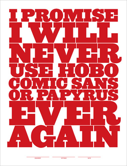
In Type I, students often ask me: "Which fonts should we use?" This is a tricky question, as students are always looking for some magic formula, such as: Snappy Copy + Helvetica Neue + Pantone 490 = Good Design. Ah, would that it were that easy. Unfortunately, the use of well designed typefaces does not automatically lead to good typography; God knows I've seen plenty of crappy projects set in Gill Sans, which is not an inherently terrible typeface. With students, it is much easier to say which typefaces should be avoided at all costs. Almost every quarter, in every class, I express my extreme distaste for the wretched Papyrus. So legendary is my disdain for Papyrus, that students have taken to using it as a sort of twisted font of endearment with me (see below).

Thanks to Jeff Matz of Lure Design, we now have this lovely Simple Typographic Pledge in poster format. I encourage designers, particularly educators, to post this Pledge wherever fonts are used. And perhaps, in some utopian distant future, all evidence of Papyrus, Hobo and the like will be eradicated from our material culture lest future generations judge us a tacky, typographically insensitive boobs.

Thursday, February 19, 2009

Feeling the Love


I was most excited to receive one of Marian Bantjes's lovely Valentines. I recently had the good fortune to host Marian when she was here for the opening of Marian Bantjes Shows Off. In person, she is a force of nature: breezing into town in a big comfy Cadillac a mere 15 minutes before her artist's talk, swallowing a handful of cheese slices on Ritz crackers (she was hungry and that's all we could scrounge up in a hurry), and proceeding to give one of the most funny, poignant, articulate presentations I've ever seen. Fabulous. I felt like we received a little sprinkling of pixie dust.

And now the Valentine. It's a beautiful and mysterious little love (?) letter that begins and ends in medias res. I've read it and reread it. The lettering is dense and swash-filled and contains phrases like "cow eyes or kitten breath or python squeezes or whatever turns your fancy". The ambiguity is what makes the Valentine so memorable. Who is the true recipient? What is this story about? It feels like a bit of a voyeuristic intrusion just to read it. And the paper: pink vellum, of course. I think Marian is single handedly keeping Reich Paper (I'm assuming that's what she used) in business.

Thank you, Marian for such a sweet little gift.

Wednesday, February 4, 2009

Alexander Gírard at House Industries


Could there be any better tribute to a beloved and iconic designer than to have a series of typefaces created in one's honour? House Industries has just released a veritable cornucopia of Alexander Gírard-inspired fonts and products. The Gírard products are not cheap, but they are gorgeous and sunny and full of happy optimism. I know it's extravagant, but my little Liliana might just have to get a Rosy Casa Doll: