Showing posts with label typography. Show all posts

Wednesday, February 25, 2009

Typographic Pledge


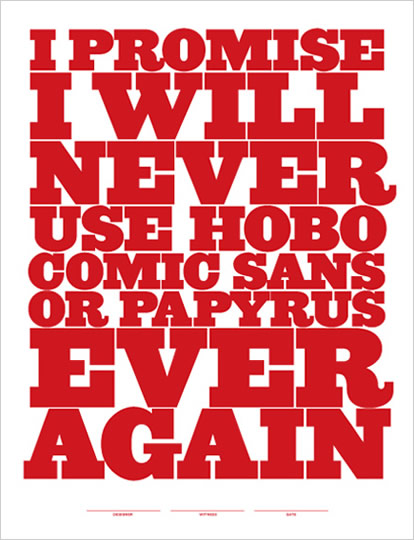
In Type I, students often ask me: "Which fonts should we use?" This is a tricky question, as students are always looking for some magic formula, such as: Snappy Copy + Helvetica Neue + Pantone 490 = Good Design. Ah, would that it were that easy. Unfortunately, the use of well designed typefaces does not automatically lead to good typography; God knows I've seen plenty of crappy projects set in Gill Sans, which is not an inherently terrible typeface. With students, it is much easier to say which typefaces should be avoided at all costs. Almost every quarter, in every class, I express my extreme distaste for the wretched Papyrus. So legendary is my disdain for Papyrus, that students have taken to using it as a sort of twisted font of endearment with me (see below).

Thanks to Jeff Matz of Lure Design, we now have this lovely Simple Typographic Pledge in poster format. I encourage designers, particularly educators, to post this Pledge wherever fonts are used. And perhaps, in some utopian distant future, all evidence of Papyrus, Hobo and the like will be eradicated from our material culture lest future generations judge us a tacky, typographically insensitive boobs.

Tuesday, August 5, 2008

Love Stories, Bantjes Style

Could the work of Marian Bantjes be more amazing? I think not. In January, I will have the opportunity to host Marian for an exhibition of her work on campus and I can't wait (okay, I'm totally peeing my pants in anticipation). To say that I admire Marian's incredible typographic stylings is a gross understatement. Even time I see a new piece I'm blown away by both her wit and artistry. Lucky subscribers to Creative Review will receive the beautiful, touching, and funny Love Stories Monograph. I particularly like the visual ode to cake:


If you're in need of a little cry, check out the mom piece. It's tough to read, but worth the effort.

Wednesday, July 30, 2008

Design Mind from the Minds at Frog Design

It's always very satisfying when former students let you know that they are actually getting to do some design (as opposed to fetching lattes and doing type monkey production work). I received a copy of Frog Design's new publication: Design Mind from a recent grad who worked on both the magazine and web site layouts. The current issue includes a nice interview with Erik Spiekermann on how he developed a series of gorgeous house numbers for Design (not quite) Within Reach.


Nice work on the design, Jokubas.

Tuesday, July 22, 2008

Comic Sans Saves the Day?

Those crazy kids at College Humor have a hilarious take on fonts:

Monday, July 21, 2008

Gorgeous Napkin Type


I don't really know much about SHCH Graphics Group other than the fact that they have some absolutely stunning (sounds like a Tim Gunn expression) typography featured on their website. Somebody(ies?) in their studio is beyond skilled with a pen and ink. I will never again have the same view of the simple napkin sketch now that I have seen what typographic heights can be achieved on this less than forgiving substrate. Oh l'amour, those napkins put me in my happy place.

Wednesday, July 2, 2008

A Dream Come True: Type Camp


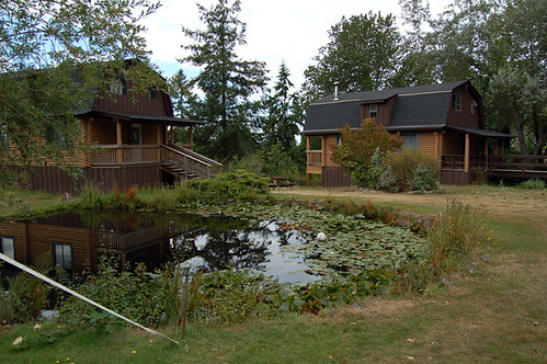
Ever since I took a summer book arts workshop at Penland School of Crafts in the Blue Ridge Mountains of North Carolina, I've been a huge proponent of art camps. It works like this: you go to some incredibly beautiful—often times remote—location, stay in a charming cabin, eat healthy food prepared by someone else, and take workshops in the media of your choice during the day. There is usually lots of studio time and blissfully quiet down time to contemplate the beauty of nature when one is not working in the studio (although, strangely, inspiration comes easy at art camp, so studio time fills a good portion of the day and night).

Little Iain and I accompanied Jeff to Anderson Ranch when Iain was a mere three months old. Even though I wasn't taking a workshop, it was fantastic to soak up some of the positive vibe at Anderson Ranch, which is one of the swankier art camps around.

However, just when I thought I knew about all the good art camps, I stumbled upon the ultimate camp for graphic designers: Type Camp on spectacular Galiano Island in British Columbia. I'm thinking summer of 2009: a family vacation in the gorgeous B.C. wilderness (posh cabins are as wild as I get) with mommy geeking out on type for a week. A dream come true.

Iain's First Trip to Art Camp, 2005: near Anderson Ranch, Snowmass, Colorado

Tuesday, June 10, 2008

Crazy Type


This crazy, intricate collaged type by Oliver Barrett at Go Media is simply amazing. I was just at an award's banquet for students in which one of the speakers advised them: "Maybe you should go somewhere lame, like Cleveland. (as opposed to the usual destinations of S.F. and L.A.)" Californians tend to think that the entire of middle of the country is a complete wasteland—and it can be, in winter. But, evidently, there's some pretty hot design coming out of Cleveland. Maybe it's not so lame after all.

Monday, April 7, 2008

Free Little Font


I just found this sweet little free font—Unibody—available for free download from Underwear. It's only intended to be used at 8pt., which makes it just right for captions or other applications where small text is appropriate. Thanks to the folks at i love typography for continuously finding cool, sometimes free, fonts.

Wednesday, March 26, 2008

I Heart Papyrus (?!!)


Good God Almighty: I just found a site devoted to the glorification of Papyrus—arguably the most poorly designed, overused typeface of the contemporary era. What exactly is Papyrus referencing? Degraded calligraphy on rough paper? The ancient world? All things granola? Orientalism?

What is it about these awful display faces that captures the imagination of so many practitioners with access to Photoshop ("designers" who use Papyrus would use Photoshop for all their typographic stylings)? It rivals my old favorites Remedy and Fajita, which were at their zenith in the mid 1990s.

* I actually think the I Heart Papyrus site is tongue-in-cheek. It just has to be.

Tuesday, March 25, 2008

Environmental ABC's


I stumbled upon these fabulous alphabet prints by GrĂ©goire Ganter via thetypejunkie. I have always loved urban vernacular typography, and Mr. Ganter's juxtapositions are simply charming. Apparently, Mr. Ganter started his collection of alphabet images when he and his wife could not find suitable baby room decor. Nice work—yet another designer rearing a typographically sophisticated child. I'm already teaching my Iain that Papyrus is the devil and should never be used.

Tuesday, March 11, 2008

Letter Ice

I just discovered these super cool Letter Ice (jello?, cookie?) trays at swissmiss. How fabulous would little pomegranate juice letter ice cubes look in a tall glass of fresh lemonade? Apparently, Letter Ice is seeking a distributor in the U.S. and abroad. I hope they find one, because the typographic possibilities are endless.

Monday, February 11, 2008

Typography as Art: Tauba Auerbach


I first saw S.F.-based artist Tauba Auerbach's work a few years ago. Quite simply: it blew my mind. Witty and impeccably drawn, her typographic interpretations are stunning. I want them in every room of my house. Look at that "I" created from a tangle of flourishes (by the way, it's ink on paper, not digital). Tauba Auerbach is my official Valentine's Day artist crush.

Wednesday, February 6, 2008

Gifts for Type Lovers


What to buy for the lover of typography? How about these pretties from Fishs Eddy (one of my absolutely favorite NYC spots for housewares: thanks to good friend Jason for bringing me there many years ago). These luverly alphabet mugs are highlighted on the Hoefler and Frere-Jones Type Foundry site. My Iain would look so cute, sipping his chocolatte from this sweet "I" mug:

Monday, October 8, 2007

Misprinted Type


I absolutely adore the collage/illustration/typographic work of Brazilian artist Eduardo Recife. His drawings and experimental type projects can be seen on the Misprinted Type site:

Isn't the lettering stunning? It is expressive, quirky, and beautifully rendered. Eduardo even offers some fabulous free fonts for download. Thank you, Eduardo, for making the world a more typographically beautiful place.