Thursday, March 5, 2009

Tropicana Travails

Well, it came and it went: the redesigned carton for Tropicana Pure Premium orange juice— derided as European, at best, and generic, at worst. It wasn't until the Tropicana debate erupted on the blogosphere that I realized European has such negative connotations; from a design standpoint, European is usually considered a positive. Evidently not to Tropicana loyalists. When I first encountered the new carton, my initial reaction was more ambivalent than negative. It certainly stood out amidst all of the orange (the fruit), orange (the color) and orange tree imagery on all the other cartons of juice. The new Tropicana logotype, which preserved the little green leaf over the "i", seemed an improvement over the previous version, which contained two of my least favorite design conventions: curved type and a gradation. The image of the stemmed glass of juice looked suitably enticing and spoke to a new emphasis on elegance (after all, isn't it rather fancy to drink one's juice from a stemmed glass?).

However, on closer inspection (because I had to buy it), I found the typography to be in serious need of refinement: bad justified paragraphs, two many weights and styles, excessively long line lengths, type placed on the vertical for no apparent reason, etc. In short, not very European.


I certainly didn't feel strongly enough about the redesign to complain to PepsiCo, unlike denizens of loyal Tropicana consumers. This week, Tropicana announced it would return to the original carton design, while maintaining the new, slightly sexual, bulbous orange-shaped cap. So the iconic orange with the red and white striped straw is back. It's an appealing image; it always was, with the implication of fresh squeezed taste. Although, I know fresh-squeezed o.j., and, Tropicana Pure Premium, you're no fresh squeezed. However, Tropicana—even the original design above—is still the best looking mass brand of o.j. on the shelves.

I'm curious to see how the equally controversial Pepsi redesign (also by the Arnell Group) plays out in the coming weeks. Good God, is it too European?

Wednesday, February 25, 2009

Typographic Pledge


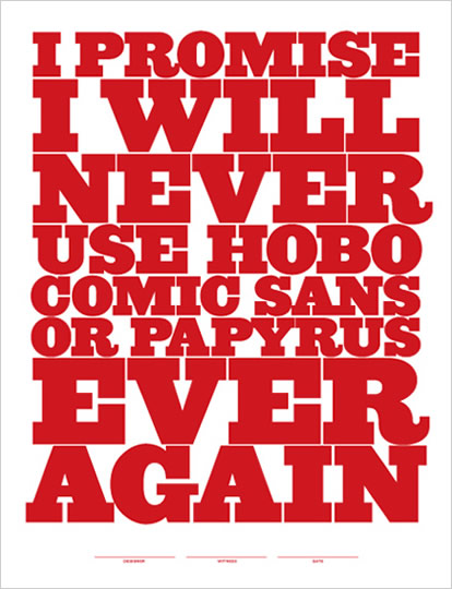
In Type I, students often ask me: "Which fonts should we use?" This is a tricky question, as students are always looking for some magic formula, such as: Snappy Copy + Helvetica Neue + Pantone 490 = Good Design. Ah, would that it were that easy. Unfortunately, the use of well designed typefaces does not automatically lead to good typography; God knows I've seen plenty of crappy projects set in Gill Sans, which is not an inherently terrible typeface. With students, it is much easier to say which typefaces should be avoided at all costs. Almost every quarter, in every class, I express my extreme distaste for the wretched Papyrus. So legendary is my disdain for Papyrus, that students have taken to using it as a sort of twisted font of endearment with me (see below).

Thanks to Jeff Matz of Lure Design, we now have this lovely Simple Typographic Pledge in poster format. I encourage designers, particularly educators, to post this Pledge wherever fonts are used. And perhaps, in some utopian distant future, all evidence of Papyrus, Hobo and the like will be eradicated from our material culture lest future generations judge us a tacky, typographically insensitive boobs.

Thursday, February 19, 2009

Feeling the Love


I was most excited to receive one of Marian Bantjes's lovely Valentines. I recently had the good fortune to host Marian when she was here for the opening of Marian Bantjes Shows Off. In person, she is a force of nature: breezing into town in a big comfy Cadillac a mere 15 minutes before her artist's talk, swallowing a handful of cheese slices on Ritz crackers (she was hungry and that's all we could scrounge up in a hurry), and proceeding to give one of the most funny, poignant, articulate presentations I've ever seen. Fabulous. I felt like we received a little sprinkling of pixie dust.

And now the Valentine. It's a beautiful and mysterious little love (?) letter that begins and ends in medias res. I've read it and reread it. The lettering is dense and swash-filled and contains phrases like "cow eyes or kitten breath or python squeezes or whatever turns your fancy". The ambiguity is what makes the Valentine so memorable. Who is the true recipient? What is this story about? It feels like a bit of a voyeuristic intrusion just to read it. And the paper: pink vellum, of course. I think Marian is single handedly keeping Reich Paper (I'm assuming that's what she used) in business.

Thank you, Marian for such a sweet little gift.

Wednesday, February 4, 2009

Alexander Gírard at House Industries


Could there be any better tribute to a beloved and iconic designer than to have a series of typefaces created in one's honour? House Industries has just released a veritable cornucopia of Alexander Gírard-inspired fonts and products. The Gírard products are not cheap, but they are gorgeous and sunny and full of happy optimism. I know it's extravagant, but my little Liliana might just have to get a Rosy Casa Doll:

Tuesday, January 20, 2009

Barack Obama: The Triumph of Good Design

There are many reasons why Barack Obama has become the 44th president of the United States, however, I like to think of his campaign as a triumph of good design. And I mean design in the most general sense of the word, but particularly, definitions 1, 2, and 5 from Merriam-Webster's Dictionary:

1 a: a particular purpose held in view by an individual or group designs for his son> b: deliberate purposive planning design>
2: a mental project or scheme in which means to an end are laid down
5 a: an underlying scheme that governs functioning, developing, or unfolding : pattern , motif design of the epic> b: a plan or protocol for carrying out or accomplishing something (as a scientific experiment) ; also : the process of preparing this

Many months ago, during the long, but entertaining primary, season, I looked at the websites of several of the candidates. Barack Obama's site was a breath of fresh air in contrast to the amateur and cluttered sites of, literally, every single candidate on both sides. Obama was the only candidate with a clear graphic identity: the eventually ubiquitous rising sun logo that proved so adaptable throughout the course of the campaign. The barackobama.com website utilized typography, icons, and color in an organized, orderly manner; it was easy to navigate and customize via a Facebook-esque dashboard. Much like the Obama campaign, the website was truly contemporary and sophisticated, demonstrating a technological savvy untouched by any of the other campaigns. The Obama camp ran the first ever Millennial, grassroots, viral campaign that took advantage of the web as the ultimate venue for information distribution and community building. People—young people, old people, multi-ethnic people, previously apathetic people—were actually inspired by and engaged in politics, many for the first time ever.


Of course, as a designer, I'd like to think that good design—developing a clear vision with a strategic plan to make that vision manifest—was largely responsible for Barack Obama's success. This is not to diminish President Obama's charisma, charm, eloquence, vigor, intelligence, and incredible sense of style. In retrospect, poor John McCain (and his train wreak of a campaign) never had a chance. He just seemed old and out of touch, while Obama really did come to represent, dare I say it: hope.

In the months since Obama was elected, his design team has continued to update and re-tool his online identity, first with the change.gov site:


And, now, with the newly released whitehouse.gov:


Gone is the bold, sans serif Gotham, replaced with the more formal, and quite beautiful, Hoefler Text, along with a softer sans serif: Whitney (looks great here). Two more gorgeous typefaces from one of the best foundries around: Hoefler & Frere-Jones. The new website is, naturally, more white and definitely more formal, however, it still maintains enough typographic, layout, and navigational similarities to the original barackobama.com site that it looks like a logical visual evolution.

Many people, myself included, have high hopes for President Obama and his new administration. It's much more difficult to run a country, especially a country as wreaked as ours, than to create a nice website. However, I think Barack Obama exceeds the sum of his parts and has the potential to actually effect change, provided he sticks to his guns and continues to have a design.

Wednesday, January 14, 2009

Marian Bantjes Shows Off


I am so super duper excited about Marian Bantjes's upcoming visit to the Central Coast. Due to random forces beyond my control, Marian agreed to do a show (her first ever one woman gallery exhibition) in our humble University Art Gallery. Technically, I am the curator of this show, although my task was ridiculously easy (except for stringing all those itty bitty little hearts on vellum that dangle from the big LOVE banner) as Marian planned the layout and installation of the work down to the last minutiae. The show is absolutely stunning and provides a rare insight into the workings of a hyper-creative mind. Marian's choice of media is diverse and unconventional, ranging from traditional drawing materials to sugar and fake fur. She is incredibly prolific, yet her work always maintains an astonishingly high (i.e., mind blowing) level of detail and intricacy.

The show includes over 130 separate pieces and provides the viewer with an opportunity to experience a full range of Marian’s creative endeavors, including: original drawings, paintings, fabric pattern design, typeface development and tons of printed pieces on unique substrates using way cool techniques (like laser cutting and foil stamping). It rocks my world. If my students aren't inspired and fired up by this, I will sink into a deep pit of despair.


Thursday, January 8, 2009

Happy Birthday Elvis


Today is Elvis's birthday. Here is my ode to you:

Elvis
King of Rock and Roll
You of the Pelvis
Treat Me Like a Fool
Treat Me Mean and Cruel
But, Love Me
Consumer of Meatloaf
Wearer of the Jumpsuit
'68 Comeback Special
Name in Lights
Jungle Room
King of Excess
Mystery Train
Voice of an Angel

Elvis, I hope you have found Peace in your Valley. Today, I had a fried peanut butter and banana sandwich in your honour.