Wednesday, July 30, 2008

Design Mind from the Minds at Frog Design

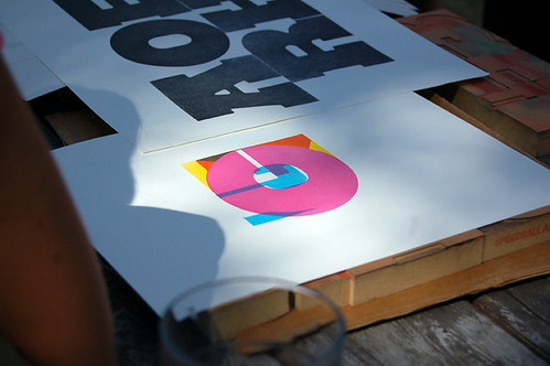
It's always very satisfying when former students let you know that they are actually getting to do some design (as opposed to fetching lattes and doing type monkey production work). I received a copy of Frog Design's new publication: Design Mind from a recent grad who worked on both the magazine and web site layouts. The current issue includes a nice interview with Erik Spiekermann on how he developed a series of gorgeous house numbers for Design (not quite) Within Reach.


Nice work on the design, Jokubas.

Thursday, July 24, 2008

Seasonally Inappropriate Dessert


I came across this recipe for Lazy Daisy Oatmeal Cake in a rather roundabout way. It looked so yummy that I had to make it immediately, in spite of how seasonally inappropriate it is. Berries and Cream, No-Bake Cheesecake, Tropical Sorbets, Semifreddo: that's the sweet stuff of summer. Oatmeal, nutmeg, and, God forbid, the broiler: perfect for a fall day in Wisconsin.

What can I say? A craving is a craving. And let me tell you: this cake is a stunner. It's super moist and delicious. Plus, I've always considered desserts than contain oatmeal to be health food, really (clearly one cup of oatmeal cancels out 3 sticks of butter):

Lazy Daisy Oatmeal Cake

1 1/4 cups boiling water + 1 cup oatmeal
1/2 cup butter

1 cup sugar

1 cup light brown sugar

1 teaspoon vanilla

2 large eggs

1 1/2 cups flour
1 teaspoon baking soda

3/4 teaspoon cinnamon

1/2 teaspoon salt

1/4 teaspoon nutmeg


Frosting:

1/4 cup butter

1/2 cup light brown sugar -- packed

2 tablespoons milk
1/3 cup nuts -- chopped
3/4 cup coconut flakes


Pour boiling water over oatmeal. Let stand 20 minutes. Beat butter until creamy. Gradually add sugar and brown sugar. Beat until fluffy. Blend in vanilla and eggs. Add oatmeal and mix well. Sift flour, soda, cinnamon, salt and nutmeg together. Add to oatmeal mixture. Bake at 350 degrees for 50-55 minutes in a 9" pan.
[I used a 10" round pan] Frosting: Cream butter with brown sugar. Add milk. Stir in nuts and coconut. Spread over cake and broil until bubbly.

*Note: I was hoping to avoid the broiler part, as nothing terrifies me more than using the broiler, and, afterall, it is July. However, this step is not to be skipped or the frosting will taste too much of grainy brown sugar. The broiling literally takes seconds: don't walk away and be prepared to pull it out as soon as the frosting starts to bubble and melt.

Wednesday, July 23, 2008

Why Being a Designer Can Be Hell

Or, why clients often make me want to put a bullet in my head:


Thanks to Robert at ND for sending me the link to Today's Big Thing.

Tuesday, July 22, 2008

Comic Sans Saves the Day?

Those crazy kids at College Humor have a hilarious take on fonts:

Monday, July 21, 2008

Gorgeous Napkin Type


I don't really know much about SHCH Graphics Group other than the fact that they have some absolutely stunning (sounds like a Tim Gunn expression) typography featured on their website. Somebody(ies?) in their studio is beyond skilled with a pen and ink. I will never again have the same view of the simple napkin sketch now that I have seen what typographic heights can be achieved on this less than forgiving substrate. Oh l'amour, those napkins put me in my happy place.

Friday, July 18, 2008

Summer Indulgence: Project Runway/Rungay


Okay, as I enter the final and most heinous month of pregnancy, I need a little indulgence, and the new (and perhaps, final, sigh) season of Project Runway has arrived just in the nick of time. I don't know what's better: watching super suave Tim Gunn (my teaching muse) tell the designers they're all a bunch of uncreative "slackers" (oh, how many times have I wanted to use that term with my students) or reading the Project Rungay blog ("Project Runway and Fashion from a Bitchy Gay Perspective"). The judges are in fine form this season, already punchy and biting, although I can't say that I entirely agree with their winning and losing selections. Yes, the surface treatments on the vacuum cleaner bags that comprise the bottom section of Kelli's dress are brilliant. But, that bodice? Good God, those flattened, burned coffee filter boobie holders are ridiculous.

However, I was more shocked when poor, sad sack, awkward Jerry was eliminated for the killer nurse raincoat getup. I agree, it was hideously designed, constructed and styled, but there appeared to be some sort of concept, flawed though it was. But this:


Honestly, I just can't abide this garbage bag monstrosity by Cher's evil twin: the tacky, tasteless, un-age-appropriate Stella. A friend of mine made a sexier, punk rock princess frock out of a garbage bag in the sixth grade. True story. Let's hope they don't keep this talentless freak on the show just because she's an "interesting" personality.

Tuesday, July 15, 2008

Why I am a Designer


My friend, and fellow designer Jason, just alerted me to this hilarious pie chart from the ChangeOrder blog. So true: especially the "chunky black glasses" part. Although, the chart is skewed at little toward our (how shall I say: slightly older) generation; I'm not sure my students will ever experience the joys of a Bestine high (mmm, such a superior solvent: I can still smell it) or the fine line elegance of a Rapidograph. Dick Blick is now marketing the Rapidograph as a quaint tool worth rediscovering, which "stands out almost magically against the bland precision of computer rendered graphics." How retro.

Friday, July 11, 2008

Constraction at Deitch Projects


I'm not sure why I torture myself by remaining on the Deitch Projects mailing list, since every time a new exhibition announcement arrives, I really really really wish I lived a little closer to NYC. Take, for instance, the above installation view of Constraction, the latest show at Deitch; it looks like contemporary abstraction at its most glorious. According to the Deitch site, the artists included in the show (one of my absolute favorites: Tauba Auerbach) are "reshuffling the deck of conceptualism and minimalism" and "reviving strategies in abstraction that have fallen into disuse and reinvigorating them with contemporary concerns". That's artspeak for abstract work the acknowledges the past without being overly referential, drab, boring, and over done. Plus, it looks really cool.

Tuesday, July 8, 2008

Cool Design of the Day


I just found this inspiring site that features a fabulous design (both graphic and product) of the day: designanddesign.com. There are some very cool pieces in the archives. Designanddesign is my new favorite first thing in the morning site.

Wednesday, July 2, 2008

A Dream Come True: Type Camp


Ever since I took a summer book arts workshop at Penland School of Crafts in the Blue Ridge Mountains of North Carolina, I've been a huge proponent of art camps. It works like this: you go to some incredibly beautiful—often times remote—location, stay in a charming cabin, eat healthy food prepared by someone else, and take workshops in the media of your choice during the day. There is usually lots of studio time and blissfully quiet down time to contemplate the beauty of nature when one is not working in the studio (although, strangely, inspiration comes easy at art camp, so studio time fills a good portion of the day and night).

Little Iain and I accompanied Jeff to Anderson Ranch when Iain was a mere three months old. Even though I wasn't taking a workshop, it was fantastic to soak up some of the positive vibe at Anderson Ranch, which is one of the swankier art camps around.

However, just when I thought I knew about all the good art camps, I stumbled upon the ultimate camp for graphic designers: Type Camp on spectacular Galiano Island in British Columbia. I'm thinking summer of 2009: a family vacation in the gorgeous B.C. wilderness (posh cabins are as wild as I get) with mommy geeking out on type for a week. A dream come true.

Iain's First Trip to Art Camp, 2005: near Anderson Ranch, Snowmass, Colorado